During his time in London, Griffen led the extensive refurbishment of Harrods Menswear located on the basement floor of the luxury department store.
For more information:
A concept for a private residence in Hong Kong’s most prestigious address looking over the spectacular view of the harbour.
During his time in London, Griffen led an extensive commercial fitout for Great Portland Estates.
For more information:
https://www.makearchitects.com/projects/33-cavendish-square/
LIGHTING DESIGN - CONCEPT TO BUILT
There is a magical essence in the art of ‘plate spinning’ – a simple form and every day object whirling atop poles. A circus act and refined craft of manipulation which may leave any audience mesmerised.
The plate is recognised and utilised throughout the globe. It is a symbol of collaboration, community, sharing + nourishment.
SPINITs form echoes that of a ‘spinning plate’. Created by the assembly of three elements, to form a suspended ‘plate’ housing LED strip lighting. The light glows from the within, warming + mystifying whatever the setting that lies beneath.
SPINIT not only compliments Corporate Culture’s residential + commercial range, it adds depth + opportunity to a complete solution.
Environmental consideration is a given with the longevity of LED lighting. The component driven object allows for efficient manufacturing with minimal tools required for assembly.
SPINIT’s versatility allows for a variety of creative configurations + applications – a solo pendant or a spinning cluster.
SPINIT will add magic to any space…
-
Dimensions: 500mm dia x 85mm
Materials: spun aluminium – LED strip
Suspension: Custom upon request – powdercoated rod
-
In collaboration with Maggie McFadyen – Winner of the Corporate Culture Design Journey Competition 2012
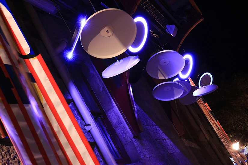
DESIGN INSTALLATION - BUILT
As mesmerising as it’s kooky, there’s a magical essence to the art of plate-spinning where everyday objects whirl atop poles through the skill of a performer. Part circus act and part refined craft of manipulation, it possesses a charm of its own.
Circus of Light is a collection of suspended plate forms that glow from within, inviting you to engage with the installation. Whirling forms and changing colour transform the site into a dynamic space that draws you closer.
The spun-aluminium forms conceal an LED light source that creates a continuous glow. The ‘plate’ appears to spin to 360 degrees and tilt up to 90 degrees; the installation continuously changes depending on your viewing perspective. Additional ‘plate’ forms populate the space, creating a dense field of play. These plate forms are lightweight, allowing them to respond to weather conditions, moving and swaying in the breeze.
The surrounding architecture becomes an illuminated backdrop, throwing the installation into sharp relief and becoming part of the artwork. The experience is supplemented by the audio overlay of a circus soundscape.
Griffen Lim and Maggie McFadyen has been collaborating on various projects and recently won the annual Corporate Culture Design Journey competition and were selected to exhibit at 2013 Sculpture by the Sea, Bondi. While their expertise lies in interior design, they always strive to explore new creative realms.
-
A special thank you to FDC for supporting the installation: Circus of Light FDC
-
project completion – 05.2014
GRAPHIC DESIGN
As a member of Bel Cantare Choir, Griffen was engaged to design the graphics for the choir’s second concert that was held on 28 July 2012. The design was based on the selected theme – ‘Off The Record’, a choral compilation of songs from sacred to musical to mainstream pop songs. The scope of the graphics work includes all print materials such as posters, flyers, tickets as well as program pamphlets that was given out on the night of the concert.
-
project completion – 07.2012
RUG DESIGN - CONCEPT
The Evolve Awards organised by Designer Rugs is a biennial design competition that offers full time professional architects, interior designers or interior design industry professionals in Australia or New Zealand the opportunity to design a rug and have their design included in the ID COLLECTION 2012/2013.
One of Griffen’s entry (Rafflesia) was shortlised in the top 25 finalists from over 450 submissions. All of Griffen’s designs were inspired by his background having born in Indonesia and each design represented a different aspect of the archipelago nation.
RAFFLESIA
Rafflesia Arnoldii, or commonly known as ‘corpse flower’ is the inspiration for this piece. The plant is noted for producing the largest individual flower on earth and can only be found in the rainforests of Sumatra – Indonesia. The intent of this piece is to capture and preserve the beauty of this near extinct plant in spite of public perception of its name. The colour and stippling technique used in this piece is to represent the flower’s appearance.
MALIOBORO
Inspired by Indonesian traditional batik fabric, MALIOBORO is a modern interpretation of traditional motif made into a contemporary rug. Different techniques such as carving, varying pile heights and viscose detailing are used to add a layer of dimension and opulence to the simple design. Whilst the use of the deep brown tone is specifically derived from one of the oldest batik traditions in Java called kraton (court) batik, this piece can be re-coloured tonally to suit different spaces.
WOVEN
The design of WOVEN is derived from traditional weaving technique that can be found in many Indonesian crafts. Materials such as rattan, bamboo or sugar cane are usually used to create products such as baskets, handbags and furniture. This particular piece is specifically designed to allow any colour changes/selections. Whether it’d be tonal or contrasting colours, this graphically striking design will be suitable to any kind of interiors.
GRAPHIC DESIGN
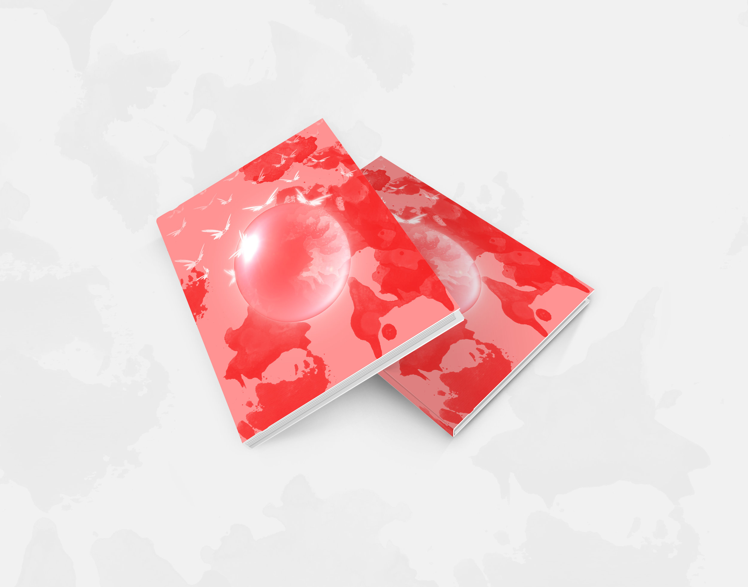
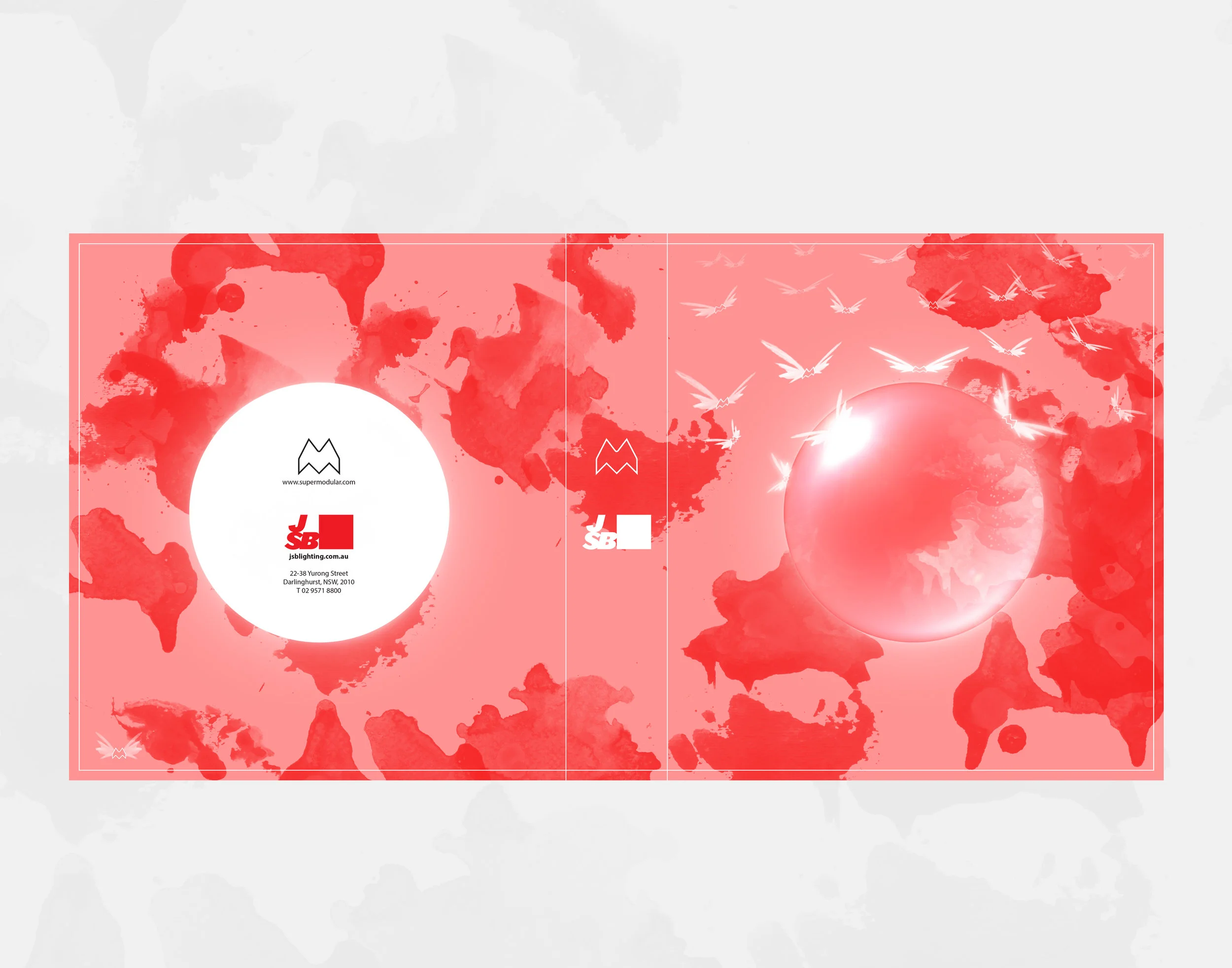
“Surrealism had a great effect on me because then I realised that the imagery in my mind wasn’t insanity. Surrealism to me is reality”. (John Lennon)
_The background explores the act of artistic creation; a fluid approach that sees an original solution every time. The artist/designer taps into their subconscious to create an image with no conventional reference. We believe this step of the design process is highly important to design innovation, originality and cutting edge
solutions.
_The crystal ball appears as a fortune teller’s tool. Modular’s success is supported by their ability to anticipate and create the future of lighting instruments.
_The ‘flying’ influences arrive from various depths of the subconscious, reactions and predictions to global activities and trends, cultural and individual emotion and response. Modular listen to the pulse of the modern day and predict the future.
-
Every two years, Belgian lighting supplier, Modular Lighting Instruments releases a new general product catalogue which coincides with a new theme, which, over the course of two years, is used by Modular across all their branding and marketing releases. Past themes have included Circo, Sweet Sixteen and Love is Love. The new theme for 2015/16 is Surrealism.
In 2014, JSB Lighting and Modular Lighting Instruments celebrated 20 years of partnership. To mark the occasion JSB and Modular joined their marketing forces to launch an Australian exclusive competition, never before done in the history of the lighting manufacturer. The task was to design the cover of the upcoming Australian release of the general product catalogue. The competition, open to Australian architects and interior designers only, required entrants to use the theme of Surrealism as inspiration for a unique and inspiring cover. The response we received was overwhelming and judging was made difficult by the high calibre of submissions received, but, in the end, the winning design was awarded to Griffen Lim and Maggie McFadyen.
PRODUCT DESIGN - CONCEPT
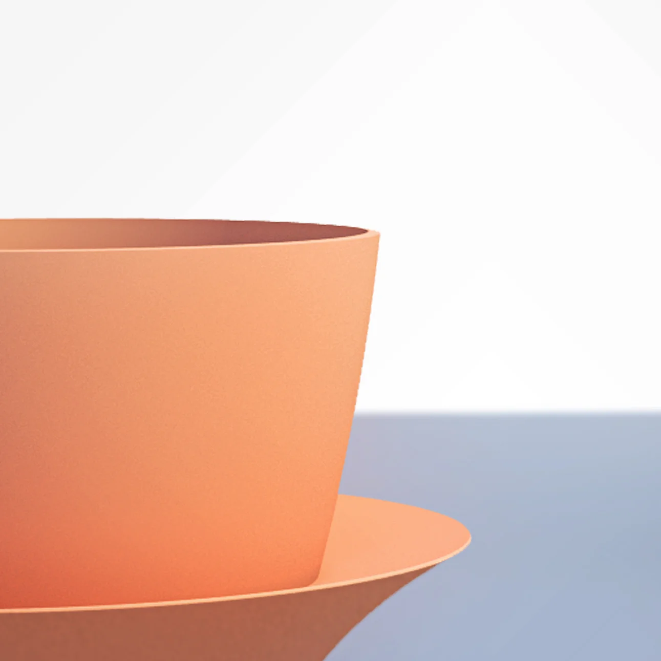
Inspired by spinning tops, ‘topple’ is a playful cup designed to prevent/reduce drink spillage. The design is of a simple cup with a feature flange that acts as a support to ensure the cup doesn’t fall flat but topples preventing any spillage.
The flange also acts as a cozy to keep the hands from the heat of the drink and when stacked this flange also prevents the cups being stuck from one another.
‘Topple’ comes in a variety of different colours and is playful as a collection.
-
Dimensions: 70dia x 100h
Manufacturing: Rotational Moulding
ART INSTALLATION - BUILT
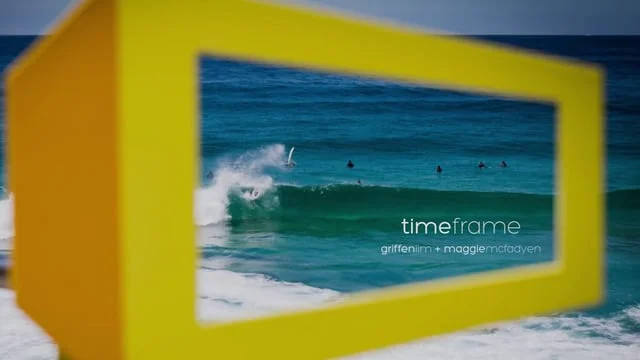
Life is often at high speed and dominated by technology – the moments where we take time to contemplate the natural world are fleeting and few
Time.Frame is deliberately ‘low tech’; framing the view in order to emphasize the idea of stopping to appreciate what occurs naturally around us
The colour yellow can be seen from a long distance away, inviting the audience to experience the view long before they arrive at the frame
Yellow is the colour of safety – the frames are located where it is ‘safe’ to stop both physically and metaphorically
At each location the face is framed in a different way and provokes ideas of aging, weathering, longevity and the future of the human race
Each frame varies as does the height. The varying size ensures there is a suitable frame for everyone, including children – it is inclusive and accessible to all
The frames are 2D objects with a 3D perspective that invite the audience to view a perhaps familiar landscape in a focussed way and with a new (different) perspective
-
Griffen Lim, in collaboration with Maggie McFadyen were selected amongst other local and international artists to exhibit their sculpture at this year’s Sculpture by the Sea exhibition in Bondi. Their piece is exhibited along the coastal walk at Tamarama Beach and invites the audience to view a familiar landscape in a focused way and with a new perspective. It also invites viewers to take time to contemplate a landscape that is forever changing and responding to the environment. The annual three week exhibition is becoming one of Sydney’s most celebrated public events attracting an estimated 500,000 people. Each year over 100 sculptures from known and upcoming artists take up residence along the famous Bondi to Tamarama coastal walk.
-
Sculpture by the Sea Bondi 2013 – 24 October – 10 November 2013
GRAPHIC DESIGN
This self-initiated project was undertaken as part of Griffen’s new identity. The concept focuses on the presentation of the designer as interior/product and graphic designer. The logo is of Griffen’s initial and was designed to represent the designer’s capability working both three dimensionally as well as two dimensionally. The use of contrasting black and white represents a blank canvas to showcase the divergent design projects Griffen has completed and reflect his design approach to new projects where every interpretation of each design brief is always unique reflecting the client’s style as well as his own.
*self-initiated project | project completion – 01.2012
INTERIOR ARCHITECTURE - CONCEPT
The idea for this florist was derived from Carolyn Burnham’s self-absorb outlook in life, where it’s all about “image” and how things “should” be.
Like Annette Bening depicted in American Beauty, this florist is “special” for there is nothing worse than being ordinary. The parasitic sculptural display speaks metaphorically for Carolyn’s journey throughout the course of the movie. Despite the fact that she goes to great lengths to be the best, we are allowed to see her breakdown as depression and desperation takes away her life until she reaches her darkest point in life.
In striving to be different, this florist sells ‘American Beauty’ roses that are frozen in sculpted ice to capture the beauty and perfection of each rose. In addition, the open back of house allows customers to view the making each of product, creating a new retail experience.
-
Design Studio 6 (UNSW BIA) | project completion – 09.2008
1st prize in DIA Graduate of The Year Awards – Interior Design 2009
INTERIOR ARCHITECTURE - CONCEPT
As the population of the world is increasing rapidly, the compact urban home could well be described as the residential typology of the 21st Century. Built upon a 100m2 site, the spatial arrangement of this 60s apartment is manipulated with a careful consideration of the existing structure, exploiting it for every moment of light, view and space. With very limited resource and tight budget constraints, the dull featureless unit is transformed into a boldly sculptural yet comfortable living environment.
While cutting edge fit-outs often make use of costly materials, this redesign employs simple material palette of limed ply, silver travertine and mirror, with emphasis on light and form. The inexpensive and flexible use of plywood was chosen to be the primary material that folds as a continuous element to create partitions and joinery. In addition, Eco-core®, an environmentally sustainable product is also introduced to add not only diversity to the delicate colour scheme, but also a response to the increasing demand of sustainable design.
The key feature of this design is the insertion of plywood blocks that serves as bedrooms and study room to fulfill the client’s need of a home office. The same strategy is also used in the kitchen and living area to conceal all equipments, highlighting the dynamic use of lines and planes. Finally, the use of simple and robust detailing allows the space to transform into a highly poetic sculpture of forms.
In short, through efficiency and good design, a high quality of life can be achieved even in the most challenging of urban sites.
-
Design Studio 6 (UNSW BIA) | project completion – 11.2008
1st prize in DIA Graduate of The Year Awards – Interior Design 2009
GRAPHIC DESIGN
‘REBUILD’ was the theme of the 2009 UNSW interior architecture graduation exhibition. The concept was developed from the constant reminder in the media regarding the global recession at the time, which had resulted in every industry including design/construction to redefine themselves in attempts to come up with new and exciting ways to revive the slowing market. Rebuild was a creative, innovative and educational response to the changing environment and encourage the rebuilding of a new future.
The graphic package includes all marketing collateral ranging from posters, flyers, sponsorship packages to websites and student’s work catalogue. In addition, the branding was also used in the exhibition’s environmental graphics and way finding down to custom t-shirt design for volunteer staff.
-
project completion – 11.2009
INTERIOR ARCHITECTURE - CONCEPT
The original approach to this brief was to promote the use of communal and sustainable facility that aims to improve the communal and social life in Chippendale.
Accesibility became the foundation of the design to ensure everyone – male, female, young, old and of course, the disabled – to be able to use the facility. The ramp replaces the stairs as means of navigation throughout the entire building allowing the elderly and the disabled to have easy access to the laundry. In addtion, a cafe area and personal waiting spaces were also inserted into the building to create a more vibrant and lively environment.
All finishes were carefully selected and designed to meet the requirement of green building design. In addition, design features such as the vertical garden wall and the drying balconies were carefully thought out to improve and promote passive solar design. As a result, not only will this facility be a big win to the community but it is also a big win to the environment.
-
Design Studio 7 (UNSW BIA) | project completion – 05.2009
1st prize in DIA Graduate of The Year Awards – Interior Design 2009